Pit: a concert app where the song introduces you.
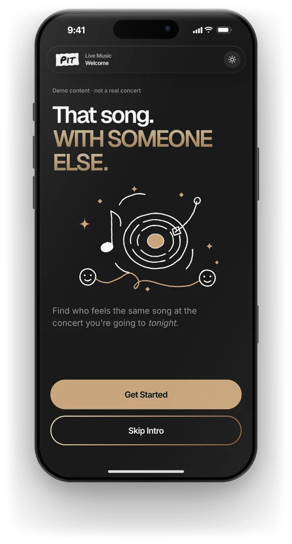
You pick one song from tonight's setlist. Whoever picks it too, finds you. Then the phone goes in your pocket.
The problem
At concerts, a lot of us spend more time looking at the screen than at the stage. And we leave without meeting the person two metres away who lost it at the exact same chorus.
Dating apps start from a face. Pit starts from the one track that hits you tonight, in this room. If it hits someone else too, you already have something to say to each other.
The moment it's built around
The night, in six moves
Every concert is a room
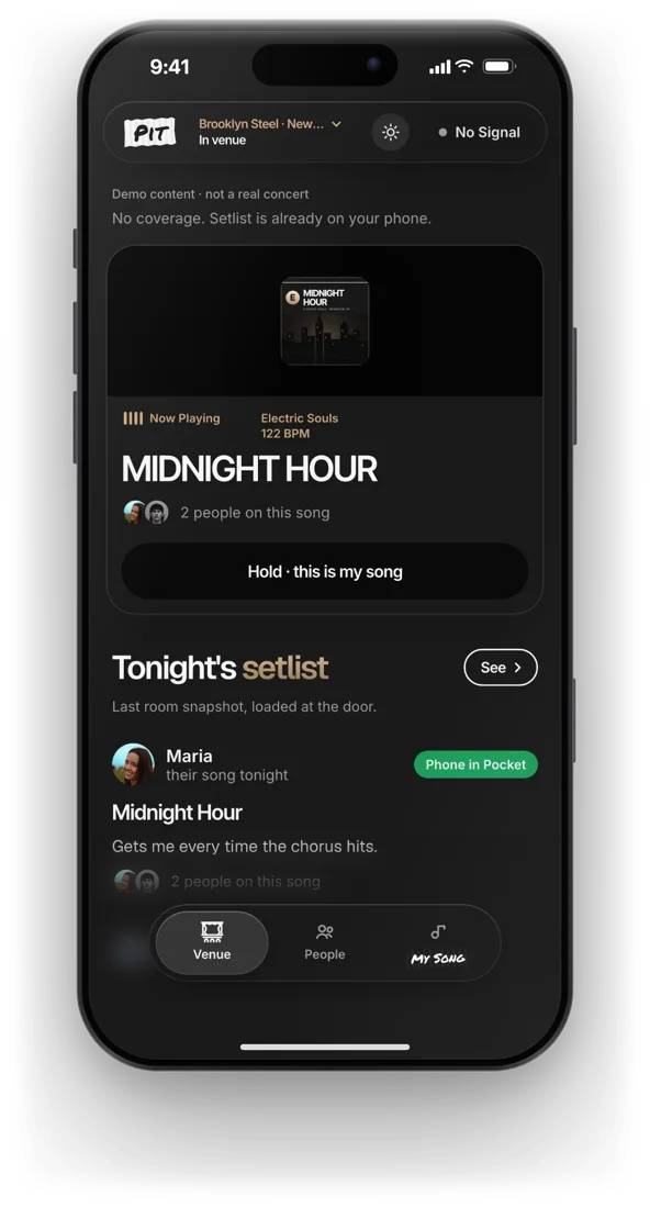
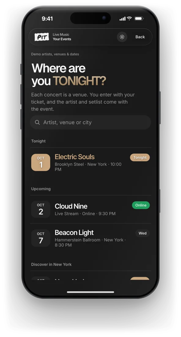
You scan your ticket and the artist's expected setlist downloads to the phone. You only ever see who's at this show, tonight. The event is the social graph.
One song, held on purpose
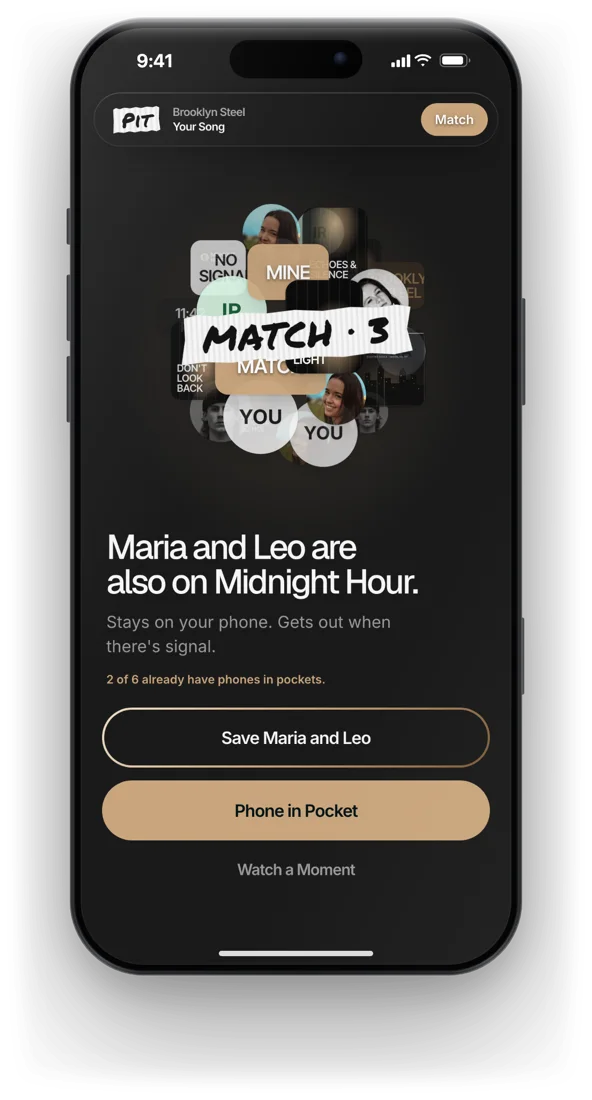
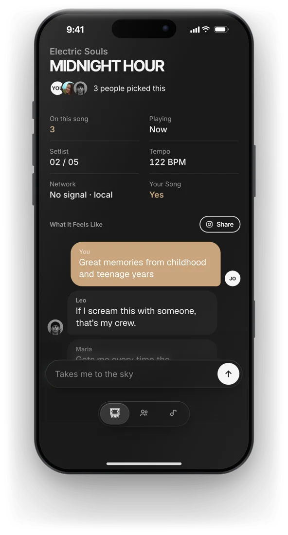
You press and hold the song that hits you. If someone else in the room holds it too, a MATCH label lands. You can't re-roll your pick to force a match, so a match actually means something.
A small chat per song
One line under the song, in a chat with the few people who picked it. The first build jumped you to another screen after posting. It felt like being pulled out of a conversation, so posting now keeps you there.
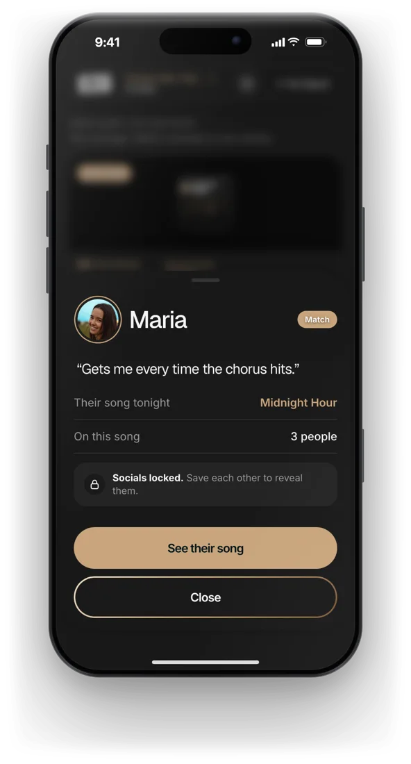
Locked until you both save each other
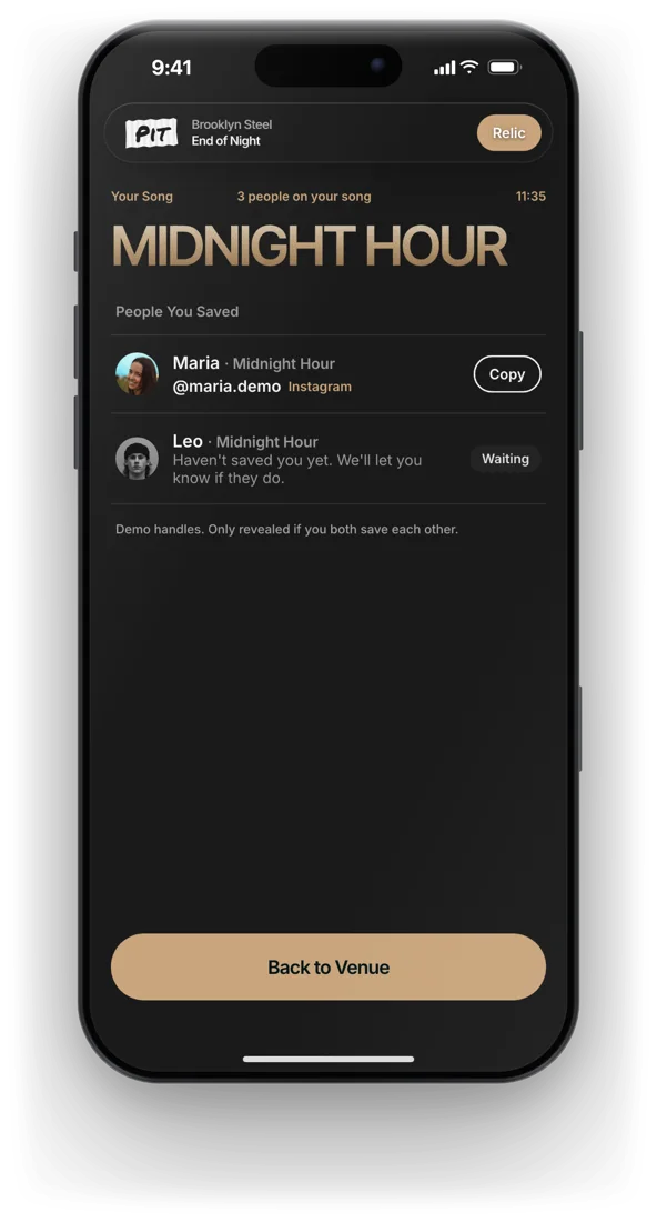
Instagram and TikTok handles stay hidden until you match and both save each other. I considered letting people pay to see a profile without a match. It would earn money and turn Pit into a dating app, so it's parked.
The one state the app celebrates
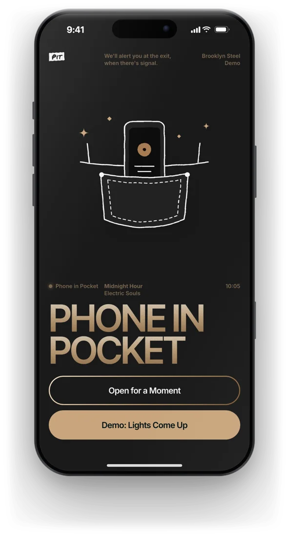
After the match, Pit asks you to put the phone away, and the others see that you did. Prestige comes from the phone in your pocket, not from scrolling.
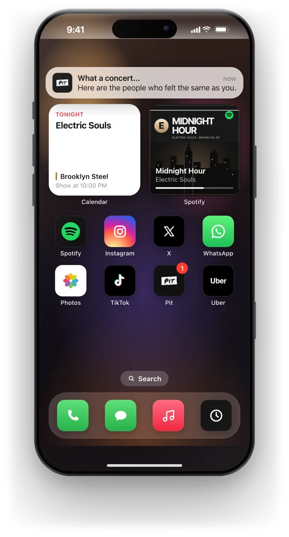
The end of the night is a real end
When the show ends, a notification brings back the people who felt the same song, with a keepsake of your night. Socials unlock only for people who saved each other.
Designed in public
I shared Pit on X while building it. Someone asked what happens if two people pick the same song and never find each other. We talked it through in the replies and landed on a subtle cue: one buzz when your match arrives in the room.
Nothing on screen, never twice per person. It went into the prototype the same day.
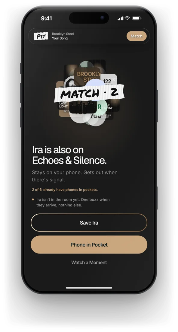
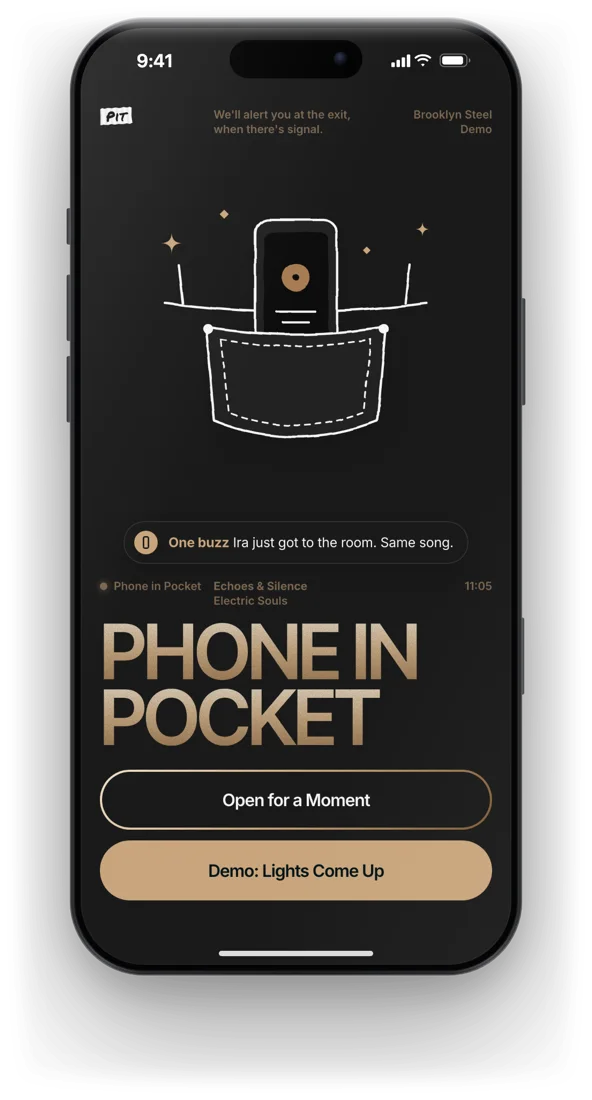
iPhone doesn't let web pages vibrate, so the prototype shows the cue on screen. A native app would only buzz.
Brand: a strip of tape
Backstage, everything gets labelled with gaffer tape and a marker: cases, cables, the setlist stuck to the stage floor. The logo is that object. The name is the place, the floor right in front of the stage.
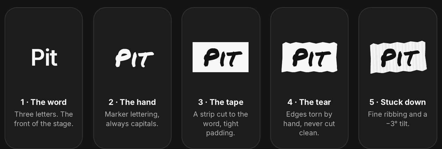
The same tape stamps the moments that deserve it: MATCH, LIGHTS OUT, MY SONG. One per screen, so it stays the only handmade thing in a calm, typographic interface. Gold marks the song and the match; green marks phones put away.
Craft details
Switching theme plays like a venue: a glass wave drops from the top and a tape label reads LIGHTS OUT or LIGHTS ON. It took more rounds than anything else to get it under half a second.
Venue coverage is bad and public Wi-Fi is worse. The setlist loads at the door and what you write waits in a queue until you leave.
Lilac with serif italics read like a magazine. Story rings made people expect Instagram. Neon blue washed out the text. Illustrated avatars made the room feel like a game.
Prototyped in plain HTML, CSS and JavaScript with Claude Code: close to 100 rounds of screenshot, one line of feedback, render. The speed meant I could try a wrong idea on a phone and throw it out the same hour.
Want to try it?
The prototype runs in the browser. Happy to share it and walk through the decisions behind it.
Ask for the prototype →